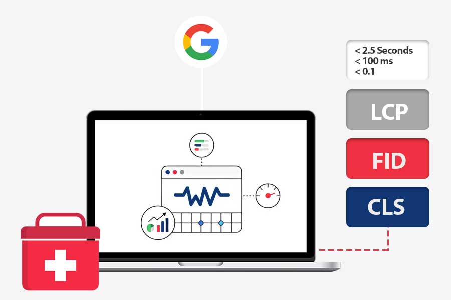
Did you know that a delay of just one second in page load time can reduce conversions by up to 7%? With users demanding faster, smoother browsing experiences, Google has made page performance a crucial factor in search rankings through its Core Web Vitals.
These metrics focus on three key aspects of user experience: loading speed, interactivity, and visual stability. In this post, we’ll dive into what Google Core Web Vitals are, why they’re essential for your site’s success, and how you can improve them to boost both your search engine rankings and user satisfaction.
Google Core Web Vitals
Core Web Vitals are a set of metrics that Google uses to measure the user experience of a website. They are designed to help website owners understand how well their site is performing from a user’s perspective.
These metrics are based on real-world user interactions and focus on three key aspects:
Load Performance
- Real-world user interactions: Core Web Vitals measure how quickly a page loads based on real-world user experiences. This means they take into account factors like network conditions, device capabilities, and user behavior.
- Key aspect: The speed at which a page’s content becomes visible to the user.
- Impact on user experience: A slow-loading page can frustrate users and lead to them leaving the site. A fast-loading page, on the other hand, can improve user satisfaction and encourage them to stay and interact with the content.
Interactivity
- Real-world user interactions: This metric measures how responsive a page is to user input, such as clicks, taps, or typing.
- Key aspect: The time it takes for a page to respond to user actions.
- Impact on user experience: A page that is slow to respond to user input can be frustrating and can lead to a poor user experience. A responsive page, on the other hand, can make users feel like they have control over the site and can improve their overall satisfaction.
Visual Stability
- Real-world user interactions: This metric measures how stable a page’s layout is during loading and interaction.
- Key aspect: The extent to which elements on a page shift or change position unexpectedly.
- Impact on user experience: Unexpected layout shifts can be disruptive and can lead to users accidentally clicking on the wrong elements or losing their place on the page. A stable layout, on the other hand, can make a page easier to navigate and can improve the overall user experience.
Core Web Vitals focus on three key aspects of a page’s performance: how quickly it loads, how responsive it is to user interactions, and how stable its layout is.
Why Are the Core Web Vitals Important?
Core Web Vitals (CWV) are essential metrics that gauge a website’s performance in terms of speed, responsiveness, and visual stability. Their importance stretches beyond just technical optimization—affecting user experience, SEO rankings, and overall business performance. Here’s an in-depth look at their significance:
1. User Experience
- Improved User Satisfaction: Pages that load quickly and maintain a stable layout ensure a smoother browsing experience. For example, when a user navigates through an e-commerce site, fast response times and stable content can make them feel more comfortable and secure. Conversely, slow or unstable pages can create frustration, leading to site abandonment.
- Reduced Bounce Rate: When users encounter slow or unresponsive pages, they’re more likely to leave. A high bounce rate suggests that users aren’t finding value quickly enough. By optimizing CWV, you can retain users, giving them more time to engage with your content or services.
- Enhanced Conversions: A seamless user journey often translates into better conversion rates. For instance, a page with optimized CWV can see visitors turn into customers at higher rates due to fewer frustrations, especially in critical moments like filling out forms or completing purchases.
- Better Brand Perception: A fast, responsive, and stable website gives an impression of professionalism and trustworthiness. Users may equate a fast website with a brand that values efficiency and attention to detail, increasing their trust and likelihood to return.
2. Search Engine Ranking
- Google’s Ranking Factor: Google officially made Core Web Vitals part of its ranking algorithm, meaning that websites with superior performance in CWV metrics are more likely to achieve better search rankings. While content remains critical, technical performance directly affects how Google perceives and ranks websites.
- Increased Visibility: Higher rankings typically lead to more organic traffic, and more traffic means more potential customers. By improving CWV, you increase your chances of appearing at the top of search results, leading to more clicks and engagements.
3. Business Performance
- Increased Revenue: Faster, more stable websites convert visitors at a higher rate. Research shows that even a small delay in page loading can result in lost sales. A study by Google suggests that for every second of improvement in loading time, conversion rates can increase substantially.
- Reduced Costs: Optimizing for faster loading times can reduce server strain, especially for websites that handle large traffic volumes. Fewer resources are required to serve faster pages, potentially lowering hosting and bandwidth costs.
- Improved Customer Loyalty: A consistently good user experience fosters customer loyalty. When users feel comfortable on your website, they are more likely to return, recommend your services to others, and become long-term customers.
Core Web Vitals are more than just technical metrics—they are foundational to providing an excellent user experience and driving business success. By focusing on them, you can improve engagement, SEO rankings, and overall business performance, ultimately creating a more competitive and effective online presence.
Understanding and Meeting Core Web Vitals Thresholds
The ideal Core Web Vitals thresholds may vary depending on your target audience. For example, users with slower internet connections may have a higher tolerance for longer LCP times. Let’s learn more about it:
Largest Contentful Paint (LCP)
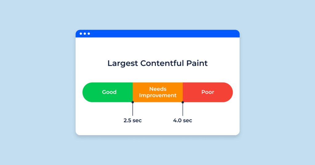
Largest Contentful Paint (LCP) is a measure of how quickly the most important content on a webpage becomes visible to the user. It’s one of the Core Web Vitals, a set of metrics that Google uses to assess a website’s user experience.
It measures how quickly the largest text block, image, or video on the page becomes visible. A low LCP means the user can see the main content of the page quickly, which leads to a better user experience.
An LCP of 2.5 seconds or less indicates that your page loads quickly, providing a positive user experience. While an LCP between 2.5 and 4 seconds is acceptable, you should strive to improve it for better results. However, an LCP greater than 4 seconds can significantly impact user satisfaction, leading to frustration and potentially causing users to leave your site.
LCP is reported when the largest contentful element within the viewport is fully rendered. This means the element’s content is visible and stable, and it no longer needs to be reflowed or resized.
Here are some key points to remember about LCP reporting:
- Timing: LCP is measured from the time the user first navigates to the page until the largest contentful element is rendered.
- Element types: The largest contentful element can be an image, text block, or video.
- Viewport: The element must be visible within the viewport for LCP to be calculated.
- Stability: The element must be stable, meaning it’s no longer being reflowed or resized.
It’s important to note that LCP is a field metric, meaning it’s measured in real-world user environments. This can sometimes lead to differences in LCP values compared to lab measurements.
Optimizing LCP for a Faster Website
Here’s a simplified guide to improve your website’s Largest Contentful Paint (LCP), the time it takes for the most important content to appear. A faster LCP translates to a better user experience.
1. Identify Your LCP Element
- Tools like Google PageSpeed Insights can pinpoint your LCP element under the “Diagnostics” section.
2. Prioritize Critical Rendering Path Resources
- Focus on loading resources essential for your LCP element and content above the fold (immediately visible area) first.
- Consider using techniques like
preloadandfetchpriority="high"in<img>or<link>tags to pre-load critical images and stylesheets. - Lazy load (delay loading) images that are below the fold.
3. Optimize Resource Sizes
- Reduce image file sizes using tools like TinyPNG.
- Minify and combine CSS and JavaScript files.
- Remove unused files and code sections (tree shaking for JavaScript frameworks).
4. Serve Files Efficiently
- Use a Content Delivery Network (CDN) to serve content from servers closer to users.
- Host resources on the same server as your website to avoid additional connection delays.
- Leverage browser caching to store frequently accessed data for faster retrieval.
5. Optimize Font Loading
- Consider using system fonts for faster loading.
- If using custom fonts, preload them or use
font-display: optionalto allow a brief grace period for font loading before displaying default fonts.
6. Manage JavaScript Execution
- Minimize unnecessary JavaScript execution.
- Defer or asynchronously load non-critical JavaScript to prevent it from blocking initial page rendering.
7. Leverage Performance Tools
Use developer tools and performance monitoring tools like PageSpeed Insights to identify and address LCP bottlenecks.
First Input Delay (FID)
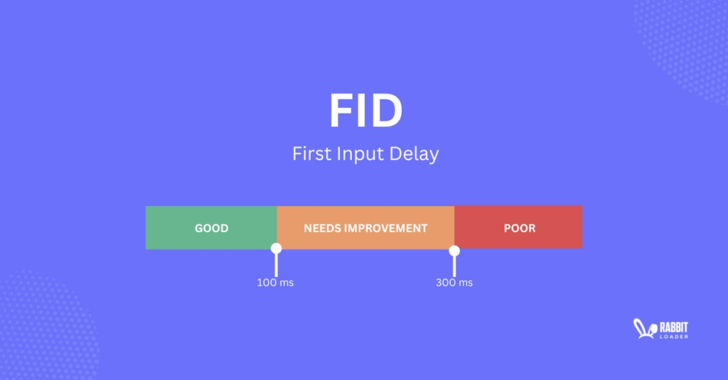
First Input Delay (FID) is a measure of how quickly a website responds to a user’s first interaction, like clicking a button or typing in a text field. If you’ve ever clicked a button and had to wait a few seconds before anything happened, you’ve experienced a high FID. A low FID means the website responds quickly to your actions, making it feel more responsive and user-friendly.
To better understand First Input Delay (FID), let’s examine what occurs when you attempt to interact with a webpage:
- Your browser sends a request to the website’s server to retrieve all the necessary files to load and display the page.
- It begins downloading and processing these files on the “main thread.”
- As the browser reads the HTML, it might start rendering parts of the page.
- When the browser encounters JavaScript files, it pauses HTML processing to handle the JavaScript.
- The browser won’t return to processing the HTML until all JavaScript files are fully handled, meaning if there are multiple scripts, it processes each in sequence before resuming the HTML.
- Each time a JavaScript file is found, this cycle repeats, often causing the webpage load to stop and restart multiple times.
When a user interacts with the page (e.g., clicks a button) while the main thread is occupied with scripts, there is a delay between the user’s action and the page’s response. This gap is known as “input delay.”
An FID of 100 milliseconds or less ensures a highly responsive page, providing a smooth and seamless user experience. While an FID between 100 and 300 milliseconds is acceptable, aiming for a lower value can further enhance user satisfaction.
However, an FID greater than 300 milliseconds can lead to a frustrating user experience, as users may perceive the page as unresponsive or slow.
What Causes Input Delays?
Input delays occur when there is a lag between a user’s interaction with a web page and the browser’s response. This can manifest in various forms, such as:
- Button clicks: A noticeable delay between clicking a button and the corresponding action occurring.
- Typing: A delay between typing characters and them appearing on the screen.
- Scrolling: A lag or stuttering while scrolling through the page.
Several factors can contribute to input delays
- JavaScript execution: Long-running JavaScript code can block the main thread, preventing the browser from responding to user interactions promptly.
- Layout reflows and repaints: Frequent layout reflows and repaints, which occur when the browser needs to recalculate the layout or redraw elements on the page, can also cause delays.
- Network latency: Slow network connections can introduce delays in loading resources and processing user interactions.
- Third-party scripts: Excessive third-party scripts can add overhead and slow down page performance, leading to input delays.
- Hardware limitations: Older or underpowered devices may struggle to handle complex web pages and respond quickly to user input.
How To Improve it?
You are trying to order a pizza online, have selected your toppings, and are about to click the “Order” button. However, the website is still busy loading images and other content in the background. Because of this, the “Order” button might not be responsive until the website finishes loading these elements. This delay is an example of FID.
Think of the website’s loading process like a busy kitchen. The “main thread” is the chef, and the files the browser downloads are the ingredients. If the chef is overwhelmed with too many ingredients to prepare at once, they might not be able to handle your order right away. This is similar to how a website’s main thread can be overwhelmed by too many files, causing delays in responding to user interactions.
Minimize JavaScript Execution
- Reduce the amount of JavaScript: Try to keep your JavaScript code as concise and efficient as possible. Avoid unnecessary calculations and DOM manipulations.
- Defer non-critical JavaScript: If you have JavaScript code that isn’t essential for the initial page load, defer its execution until after the page has rendered. This will prevent it from blocking the main thread and causing delays.
- Use code splitting: Break down large JavaScript files into smaller chunks that can be loaded on demand, reducing the initial load time and improving responsiveness.
Minimize Layout Shifts
- Minimize DOM manipulations: Avoid frequent changes to the DOM, as these can trigger layout reflows and repaints, which can be expensive operations.
- Use CSS transforms and transitions: For simple animations, use CSS transforms and transitions instead of JavaScript-based animations, as they are often more performant.
- Batch DOM updates: If you need to make multiple changes to the DOM, batch them together into a single update to avoid unnecessary reflows and repaints.
Reduce Network Latency
- Use a CDN: A Content Delivery Network (CDN) can cache static assets closer to users, reducing network latency and improving responsiveness.
- Minimize HTTP requests: Combine CSS and JavaScript files, and use sprites for images to reduce the number of HTTP requests.
- Optimize image loading: Use lazy loading for images that are not immediately visible in the viewport, and compress images to reduce their file size.
Optimize Third-Party Scripts
- Limit the number of third-party scripts: The fewer third-party scripts you use, the better. Each script can add overhead and potentially contribute to input delays.
- Optimize third-party script loading: Use asynchronous or deferred loading for third-party scripts that are not critical to the initial page load.
Consider Using Web Workers
Offload long-running tasks: If you have computationally intensive tasks that can block the main thread, consider using web workers to offload them to a separate thread. This will prevent the main thread from being blocked and improve responsiveness.
Cumulative Layout Shift (CLS)
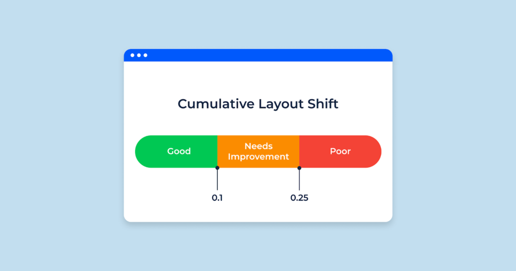
What if you are watching a movie, and suddenly the screen shifts and the characters appear in a different place. A bit strange right? This is similar to what happens when a website has a high Cumulative Layout Shift (CLS). CLS measures how much the content on a page visually shifts around as it loads. When elements appear or change size unexpectedly, it can disrupt the user’s experience and make the page feel unstable.
A CLS of 0.1 or less indicates a stable page layout, providing a consistent and predictable user experience. While a CLS between 0.1 and 0.25 is acceptable, you should strive to improve it to reduce visual instability. However, a CLS greater than 0.25 can significantly impact user experience, as unexpected layout shifts can disrupt user interactions and lead to frustration.
It’s also important to test your website’s performance on a variety of devices and browsers to identify any issues. Regularly monitor your Core Web Vitals performance to track improvements and identify areas for optimization. Prioritize improving the Core Web Vital that has the greatest negative impact on your user experience.
What Causes the Shift?
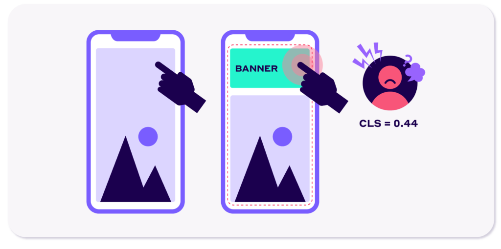
CLS measures how much the content on a page visually shifts around as it loads. When elements appear or change size unexpectedly, it can disrupt the user’s reading flow and create a frustrating experience.
So, what causes CLS?
- Images and ads: When images or ads load after the initial page content, they can cause elements to shift around as they appear.
- Fonts: If the fonts used on a page are not preloaded, they may load after the initial content, causing elements to reflow and shift.
- Dynamic content: Websites that generate content dynamically, such as those that load content through JavaScript, can experience CLS if the content’s size or dimensions are not known in advance.
- Server-side rendering issues: If a website is rendered on the server and then delivered to the client, any changes made on the server can cause CLS if they affect the layout of the page.
Ways to Improve Your Cumulative Layout Shift (CLS) Score
1. Define Image Dimensions
With the popularity of Responsive Web Design, CSS is often used to resize images. However, this can lead to layout shifts when images are loading. To avoid this, modern browsers calculate default aspect ratios based on the width and height of the image. By specifying these dimensions in the image’s HTML attributes, browsers can reserve the necessary space for images before they fully load, reducing layout shifts and improving user experience.
To apply this, make sure to set the width and height attributes on the <img> tags and use CSS to adjust the size as needed. This method helps the browser allocate the correct space, and using CSS’s auto value ensures that once the image is fully loaded, the dimensions adjust properly, keeping the layout stable.
For responsive images, using the srcset attribute can ensure the browser selects the correct image size, and maintaining consistent aspect ratios across your images further prevents layout shifts. Browsers like Chrome, Firefox, and Safari also support setting width and height attributes within the <picture> element, offering more precise control over responsive images.
For further insights on handling aspect ratios, you can refer to resources like Craig Buckler’s guide on “Jank-free page loading with media aspect ratios.”
2. Preload Fonts
Optimizing font delivery is crucial for improving CLS. Here are some strategies:
- Use
link rel="preload"to load critical web fonts early, ensuring they’re available for the initial page render and minimizing layout shifts. - Implement
font-display: optionalso the web font only loads if it’s ready when the page first displays. - Set fallback fonts with similar characteristics to your web font, accounting for the font family, weight, and width. Tools like
size-adjust,ascent-override, andline-gap-overrideAPIs can help achieve better font matching. You can learn more about font fallbacks with resources on improved font rendering. - The Font Loading API can also be used to reduce font load times and improve page stability.
3. Stabilize Ad Layouts
Ads are one of the most common causes of layout shifts. While balancing user experience and revenue can be challenging, there are ways to minimize the impact of ads on CLS:
- Place dynamically loaded content, such as ads, lower in the viewport, allowing more control over how space is allocated for it.
- Use fixed-size placeholders for ad spaces to prevent layout shifts when ads load. If you expect different ad sizes, style the container for the largest expected ad to ensure it can accommodate various sizes without collapsing the layout. Avoid removing the ad container entirely, even if an ad isn’t returned, as this can result in significant layout shifts.
- Use
min-heightCSS or theaspect-ratioproperty to reserve space for late-loading content, reducing the risk of layout movement when ads are loaded.
4. Prefer CSS Transitions Over Animations
When working with animations, it’s important to avoid re-layouts, re-paints, or re-composites to minimize CLS:
- Use CSS transitions instead of animations when possible. Transitions tend to be smoother and are less likely to cause layout shifts.
- Avoid modifying properties such as
top,left,box-shadow, andbox-sizingwhen animating elements, even when using separate layers. - Opt for properties like
transformfor translating, scaling, rotating, or skewing elements. Animations usingtranslateare less likely to cause layout shifts as they don’t trigger re-layouts.
Composited animations, such as those using translate, do not count toward CLS, allowing for high-performance animations that keep layout shifts at bay.
5. Utilize the bfcache (Back/Forward Cache)
The back/forward cache (bfcache) stores web pages in the browser’s memory after navigation, allowing quick page retrieval if the user goes back. This helps avoid re-paints and layout shifts when returning to a previously visited page.
While most browsers support bfcache by default, your site might be ineligible for it due to certain issues such as:
- Complex JavaScript behaviors
- User authentication or personalized content
- Use of non-standard navigation methods (e.g., single-page apps or AJAX-based navigation)
- Heavy reliance on external resources
- Cache-Control headers like
Cache-Control: no-store - Cross-Origin Resource Sharing (CORS) issues
Ensuring your website is optimized for bfcache can enhance page loading speed and reduce layout shifts, especially when users navigate back and forth.
Tools For Checking Your Site’s Core Web Vitals Performance
To assess your site’s performance, you can use several online tools. Here are some of them:
1. Google PageSpeed Insights
Google PageSpeed Insights is a powerful tool that provides detailed information about your website’s performance, including Core Web Vitals. Here’s a step-by-step guide on how to use it:
Visit the Website
Go to the Google PageSpeed Insights website. In the search bar, enter the URL of the webpage you want to analyze.
Analyze
Click the “Analyze” button.
View Core Web Vitals Results
The report will display your site’s scores for the three Core Web Vitals metrics:
- Largest Contentful Paint (LCP): Measures the perceived load time of the main content on the page.
- First Input Delay (FID): Measures the responsiveness of the page to user interactions.
- Cumulative Layout Shift (CLS): Measures the visual stability of the page.
Review Recommendations
PageSpeed Insights will provide specific recommendations for improving your site’s Core Web Vitals. These recommendations may include
- Optimizing images
- Minifying CSS and JavaScript
- Reducing server response time
- Enabling browser caching
- Leveraging a Content Delivery Network (CDN)
Analyze Mobile and Desktop Performance
PageSpeed Insights allows you to analyze your site’s performance on both mobile and desktop devices. This is important because different devices have different capabilities and may experience different performance issues.
Track Progress
Regularly use Google PageSpeed Insights to track your site’s Core Web Vitals progress over time. This will help you identify areas where you’ve made improvements and areas that still need attention.
2. Semrush Site Audit
Semrush Site Audit goes beyond a basic technical check-up. It dives deep into your website’s health and identifies issues that could hold back its performance, including those affecting Core Web Vitals. Here’s how to use it:
Access and Start the Audit
- Log in to your Semrush account and navigate to the Site Audit tool.
- Enter your domain name in the search bar and click “Start Audit.”
Customize Your Crawl Settings
Before starting the audit, you can adjust the Crawl Budget settings to fit your needs. For example, in the “Crawler settings” section, you can choose whether to analyze the mobile or desktop version of your site. To understand more about
Analyze Your Website
Once you’re happy with the settings, click “Start Site Audit” to begin the analysis.
Find the Core Web Vitals Report
After the audit is complete, you’ll see an overview report. Within “Thematic Reports,” locate the “Core Web Vitals” section.
View Detailed Results
Click “View details” to access a comprehensive breakdown of your Google Core Web Vitals performance. Here you’ll find:
- Page Statuses: This provides an overall picture of your pages’ health.
- Historical Performance: Track how your Core Web Vitals have changed over time.
- LCP and CLS Scores: See your website’s score for Largest Contentful Paint and Cumulative Layout Shift.
- Improvement Recommendations: Semrush will suggest specific actions to improve your LCP and CLS scores.
- Total Blocking Time (TBT): This metric helps assess First Input Delay (FID) and identify areas for improvement.
Dive Deeper into Issues
- Click on any issue listed under “Top Improvements” to learn more about how to fix it.
- Select the number under the corresponding “Affected Pages” column to see a list of all pages impacted by that specific issue.
3. Chrome User Experience Report (CrUX)
The Chrome User Experience Report (CrUX) is a valuable resource that provides real-world data on how Chrome users interact with websites. Here’s how to use it to analyze your Core Web Vitals:
Access the CrUX Dashboard
Go to the CrUX Dashboard for Looker Studio
Enter Your URL
In the search bar, enter the URL of the website you want to analyze.
View Core Web Vitals Results:
The dashboard will display a summary of your pages’ performance for each Core Web Vital, including LCP, FID, and CLS. You can view results for both mobile and desktop users.
Beyond Core Web Vitals, CrUX offers insights into other metrics like page load time, first contentful paint, and interaction time.
4. Google Search Console for Core Web Vitals Insights
The “Core Web Vitals” report in Google Search Console (GSC) is a powerful tool that utilizes real-world data to reveal how users experience your website. Here’s how to use it effectively:
Access the Report
- Log in to your Google Search Console account.
- Navigate to the “Experience” section and select “Core Web Vitals.”
Analyze Overall Performance
The report provides a high-level overview of your website’s Core Web Vitals status, categorized as “Poor,” “Needs Improvement,” and “Good” for both mobile and desktop users. This offers a quick glimpse into areas requiring attention.
Dive Deeper
- To delve deeper into specific details, click “Open Report” next to either the mobile or desktop chart.
- This view displays a bar chart showing the number of pages that fall outside the recommended Core Web Vitals thresholds.
Identify Common Issues
- Scroll down to the “Why URLs aren’t considered good” panel. Here, you’ll see a breakdown of common Core Web Vitals issues impacting your website along with the number of affected pages for each.
- Clicking on a specific issue provides more details and potential solutions.
Focus on Holistic Improvement
It’s important to remember that the Google Core Web Vitals report focuses on overall site health rather than individual page status. This view helps you prioritize improvements that can positively impact a broad range of pages on your website.
By using the Core Web Vitals report in Google Search Console, you can gain valuable insights into your website’s user experience and identify areas for optimization, ultimately leading to a better browsing experience for your visitors.
