
It was unimaginable twenty years ago that people would access websites mostly through their smartphones, as the concept of a smartphone was still unknown to many.
Over the past decade, the proportion of website traffic generated by mobile phones has dramatically increased. As of February 2023, mobile phones accounted for 60.67% of all web traffic, with an average of 60.06% for the year so far.
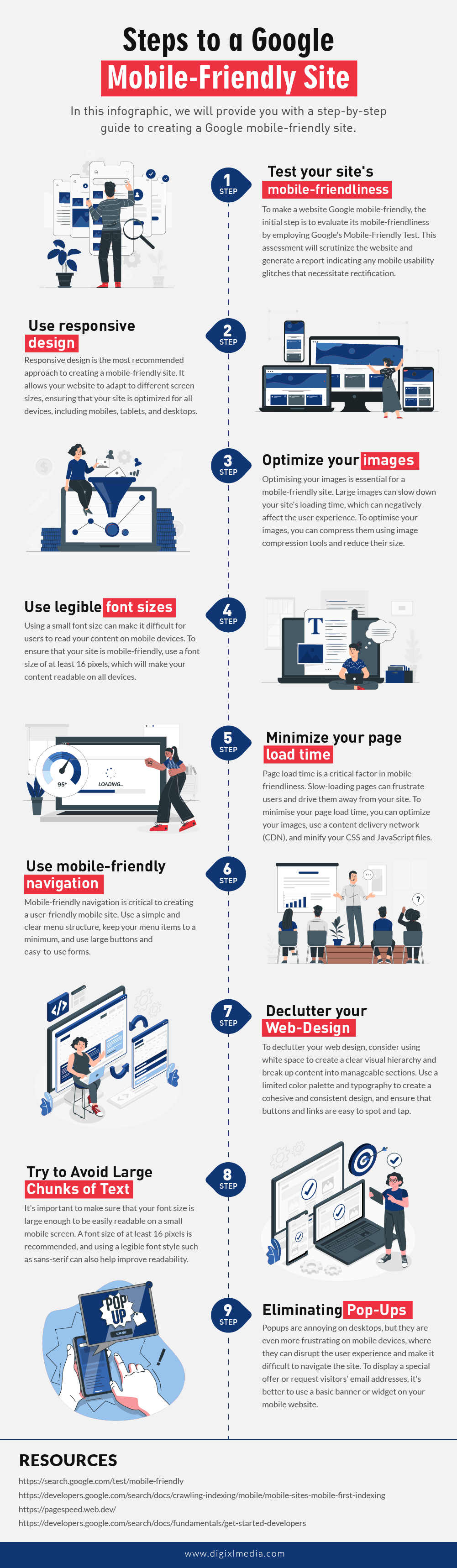
To thrive in the highly competitive market, it is not enough to simply have a website; it must also meet Google’s mobile SEO standards.
You must be wondering, “Is my website mobile-friendly?” Well, fret no more. That is why we have created a checklist to help you ensure that your mobile optimized website meets these requirements and is Google mobile-friendly. Learn more about the proven ways how to drive more traffic to your website in the following ways:
With more and more users accessing the internet through smartphones and tablets, mobile friendly tests are essential for optimizing your website as they significantly impact user experience, search engine rankings, and overall business success.
- Firstly, the majority of internet users now access the web through their mobile devices, which means that having a website that is optimised for mobile use can help you reach a wider audience.
- Secondly, Google has made mobile-friendliness a key factor in their search algorithm, which means that having a mobile-friendly site can help you rank higher in search results. This can lead to increased visibility, website traffic, and ultimately, revenue.
- Additionally, mobile-friendly websites provide a better user experience as well as a responsive design with best practices, which can lead to increased engagement and conversions.
Finally, with the rise of mobile commerce, having a mobile-friendly site is essential for businesses that want to stay competitive in today’s market.
Final Thoughts
If you are starting a website in 2023, you simply cannot forget about mobile users. Recently, many web designers and developers have even started prioritising mobile users. The future lies in the hands of mobile users, so make sure you follow the trend and always have an optimised and mobile-friendly website, no matter which platform you’re on.